
In addition to the stage plays, the International Mystery Writers’ Festival 2008 featured other activities such as workshops, book signings, the Writers’ Reels, activities for the Young Adult Theatre Academy, and the concluding Angie Awards.
The workshops were scheduled to last 45 minutes to an hour. Seating was limited, but they were free and open to the public.
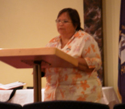
I only managed to attend the first one, on Friday, the 13th of June. Kit Ehrman was the scheduled speaker. Kit’s first novel, At Risk, was published in October, 2002, and was the first is a series of novels featuring her character, Steve Cline. The fourth book in the Cline series, and her most recent, book, Triple Cross, was published in January, 2007.
As befits the first in a series of writing workshops, Kit’s talk, “Writing Compelling Fiction,” focused on the basics. A more descriptive title might have been “Make Your Fiction Compelling by Removing the Obstacles to Clear Communication So the Reader Can More Readily Take in Your Tale.” Or, “Cleaning Up the Clutter to Reveal the Beauty Underneath.” Okay, this is why she is the writer and I am not.
I made a number of notes during her presentation, although she assured us that she had a handout available afterwards which would cover her talk.
But I was skeptical. Take indexes in the back of books. Often I’ve used them, trying to locate a passage I’d read based on a word I knew to be in the text. And I’ve generally been disappointed. Authors Durk Pearson and Sandy Shaw were so frustrated by the index made by the book company, they had the publisher include a copy in their book of an index they generated, in addition to the publisher’s index. Like Pearson/Shaw creating a complete, usable index, Kit succeeded with a complete handout which was even more thorough than her discourse. Of course, she’s a writer, not a publisher. I should not have doubted her.
I’ll cover several of her key points, but I’ll add some editorializing of my own. Any vehemence can be blamed on me; any brilliant insights can be ascribed to Kit. And, for your convenience, I’ve already taken a yellow highlighter to the notes.
She led off with the number one rule: format your submissions correctly! Editors are swamped with submissions each day. If you can’t manage to properly format your story, why would the editor think you’re capable of professional work? Formatting isn’t a “pain,” it’s a requirement. They need it so they can do their part of publishing your work. You need to do your part. You want your work published? Find out what the requirements are.
Years and years ago, when I had thoughts of writing, I would do just that. I requested and received the formatting requirements for Analog and Isaac Asimov’s Science Fiction Magazine. As far as I know, publications are still happy to send you what they need. A stamped, self-addressed envelope may not be needed since their requirements could be available on the Web. Help them...to help you!
Among the formatting details she mentioned was one of my favorites: indenting paragraphs. In this Internet world of e-mails, USENET, and, particularly, nay, most particularly, the World Wide Web, people have gotten used to leaving paragraphs flush to the left margin and relying on double-spacing to indicate paragraphs. This is no more acceptable in a manuscript than “yul8” for “Why will you be late?” Unless, of course, it’s part of texting that a character is doing.
It’s one of the many reasons I was so relieved by the arrival of Cascading Style Sheets (CSS). Once the browsers adopted CSS, I knew I could use them to properly indent my paragraphs. Prior to CSS, I needed to prefix the first word in a paragraph with several non-breaking spaces, since hypertext markup language collapses whitespace. You’ll see indenting all through my website. However, because reading off a screen can be a little more difficult than reading off a printed page, particularly when the background is multi-colored, I decided to both indent and double-space between paragraphs.
She also mentioned at this point that she had loved sentence diagramming in school. I let loose a silent “Yay!” for that. Besides appealing to the detailed part of my nature, nothing else serves the purpose of understanding how a sentence is put together quite as well as diagramming.
Next up was grammar. I was very pleased that her first recommendation was The Gregg Reference Manual by William A. Sabin I have a spiral bound copy of the 7th edition I keep at work. Because of it’s green cover and the similarity between “Gregg” and “green”, I keep referring to it as the Green Book. Naturally, she also recommended The Elements of Style by William Strunk and E. B. White.
She made some more general suggestions before beginning the longest part of her talk: “Ten Common Mistakes Every Writer Makes.”
The first was overusing “to be” or other linking verbs such as “was,” “am,” “is,” “are,” and so on. For instance, “The temperature was in the fifties” can be strengthened by changing the linking verb, “was”: “The temperature hovered in the fifties.”
The next mistake was telling instead of showing. For instance, show the character’s feelings by his actions. “Mark slammed the door” instead of “Mark was angry.” (Oh, there’s that linking verb again.)
Next, avoid repetition of words. I’ve been working
at avoiding to avoid (see -ing below) the
overuse of “talk” and “presentation” without
devolving into “speech” or “oration.” Her advice
on this was something she recommended to help with many of the problems
(particularly awkward phrasing): orate, er, read it out loud.
Avoid listing the action. “Mark went into the building, climbed A, walked B, twisted C, opened D, and entered the office.” If you’ve already established the office is upstairs in the building, “Mark went to the office” might suffice. If you must list, make it interesting. Say you need to describe the room. Rather than a flat description: “The room blah blah blah tiki blah blah,” incorporate action. “Mark walked around the room. The tiki carving glared at him disapprovingly. Mark picked it up and gauged the tiki’s heft. ‘You could put somebody’s lights out with this.’”
For “Flat Writing,” she suggested, “skip the boring parts.”
Kill those “-ly” adverbs. Don’t “run quickly,” “race.” Try to keep adverbs to two per page. Stronger verbs!
Same thing for “-ing” participles. Not “Standing on the hillside, the horse looked away,” but “The horse stood on the hillside and looked away.” Or, even better, “The muscled colt stood on the crest of the hill and gazed at the horizon.”
Don’t have characters tell each other things they already know.
Awkward phrasing? Leave the story alone for awhile, then read it again. Preferably, as above, read it out loud. That will make problems stand out so you know where rewriting is needed.
Punctuation is important. Commas are particularly important.
The next major section of her oration (I thought I wasn’t going to use that word!) was “Grabbing Your Reader--Writing Compelling.” “Nothing is more important than your first page!” (Okay, that vehemence was her.) “Agents and editors know whether or not they’re interested in your story BY THE END OF THE FIRST PAGE!” (Really, that’s her, again. She was quite forceful on this point.)
She suggested analyzing many other books to determine for yourself why you thought the beginning was, or was not, compelling. Also, you could start in the middle of action.
Conflict is integral.
“Edit, edit, edit. Writing is in the editing.”
Toss unnecessary words. “Puzzles are hard to solve” becomes “Puzzles are hard.” “She could feel the rain” becomes “She felt the rain.”
Be specific. “She ate breakfast.” Instead of “breakfast,” maybe the more specific “cereal,” or the even more specific “granola.”
Don’t use clichés.
“Trust that your reader is intelligent.”
She also gave advice on word counts. She shaved her first novel from 150,000 words to 95,000 before publication. Publishers will have a target word count.
At one point, her cell phone went off and she dropped back to check it. She explained after seeing who it was that “I hardly ever get a call.” I went from, “I can’t believe she’s checking her phone” to “Wow, it could have been something really bad. I’m glad that doesn’t seem to be the case.”
I thought her workshop offered straightforward and clear advice to anyone wishing to write well, whether for publication or not. The examples she gave in her presentation, much more than here (and lots more in her handout) were very effective. (Oh, and don’t blame the tiki example above on her; that was me getting into the spirit of things.)
I wish I had more time during the two days I was at the Festival to go to more of the workshops. Perhaps, next year, if there is more WENN to experience (to get me to the Festival), and they schedule the workshops again, I’ll attend more of the them.
